The Glowins combines natural, cruelty-free ingredients with advanced science to produce the ultimate skincare experience for women, exclusively. They came in with new challenges to get their brand developed, and we couldn’t say no!
When we first met the client, the brand was just an idea on the paper with multiple ranges in production. Inconsistent packaging bottle were made individually using the scrapbooking technique and required a lot of time to be produced. This wasn’t helping the sales. Our challenge was to create a brand with fresh logo and a new seamless packaging keeping a very natural, organic feel. They wanted the new packaging and identity to be modern, eccentric and minimal.
We started planning complete branding and identity including conceptualization of logo, visual identity, illustrations, everything. The layout was organized so that it can show naturalness without overloading the typeface that can give a clean, natural feel. A sophisticated, detailed illustration is made to show a luxurious, modern and prospective customer base. We made an everlasting value and timeless design, which appeal to this clientele and resonate with the brand.
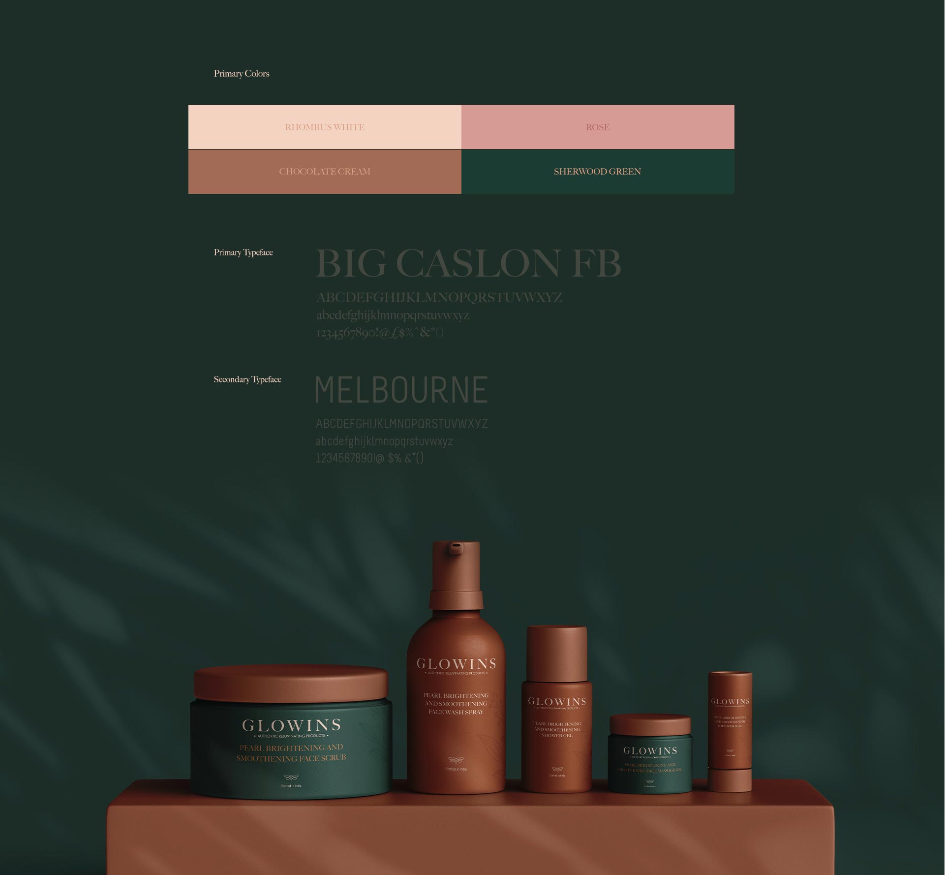
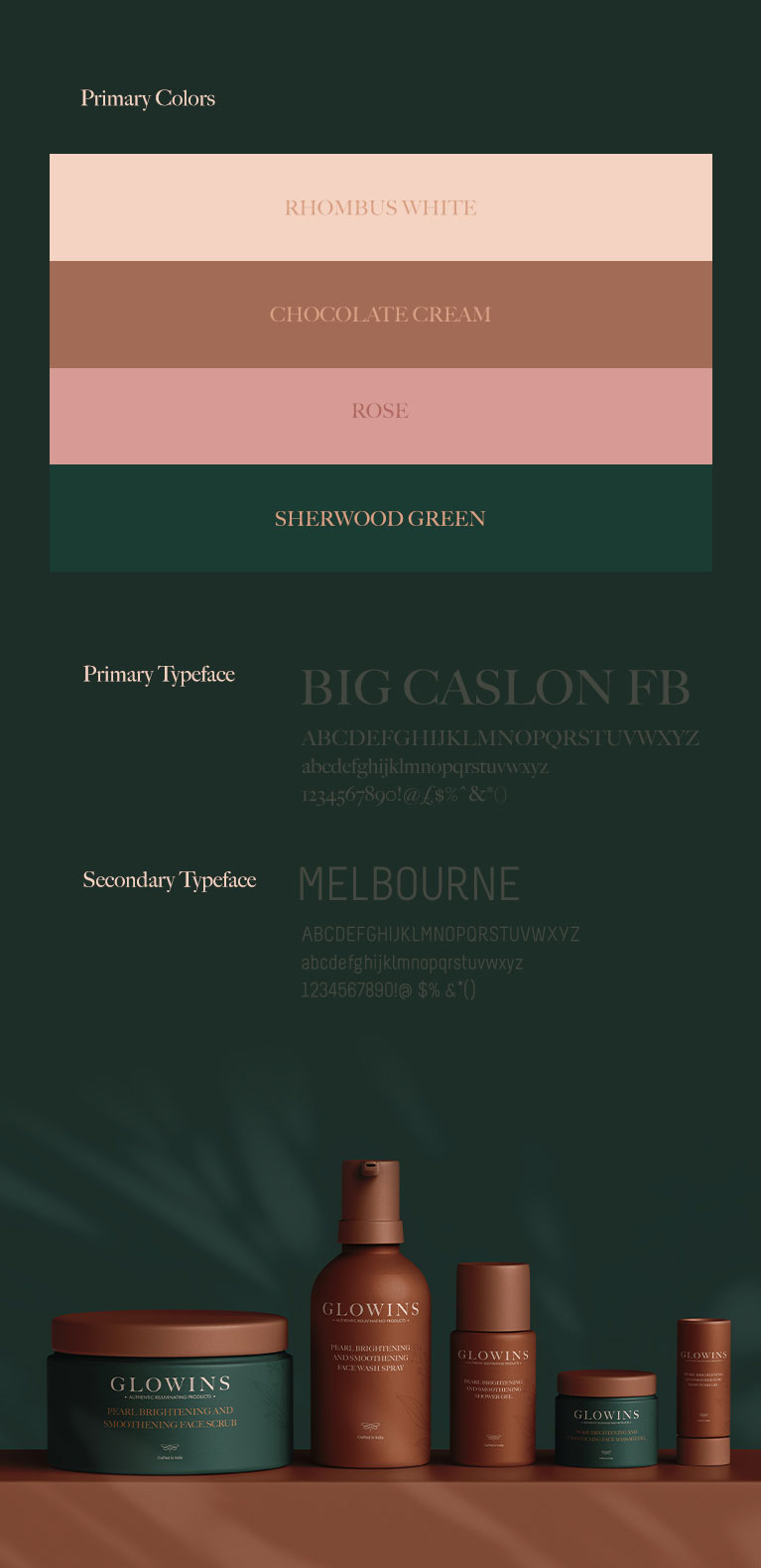
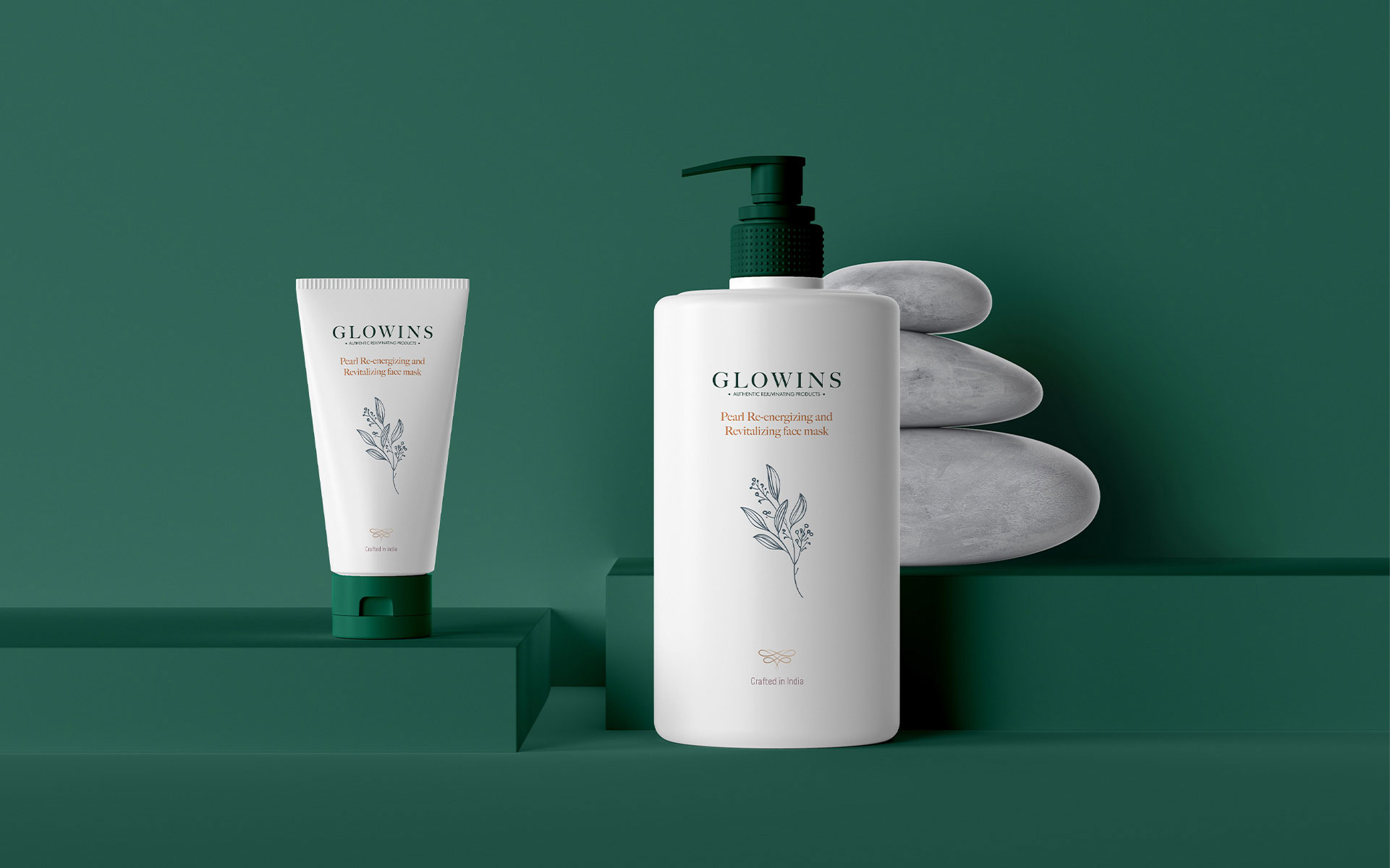
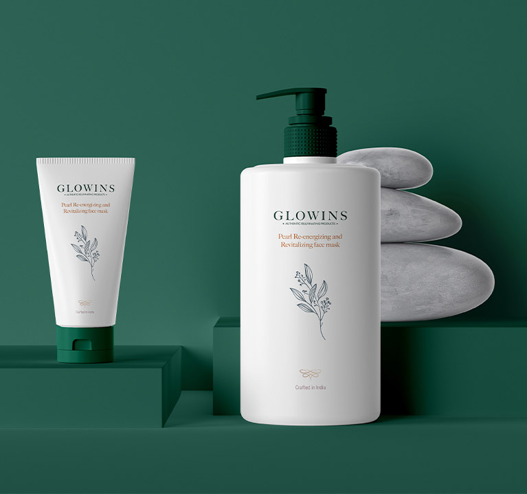
We designed Glowins- A neat design that fits the philosophy of minimizes chemicals feels clean and pure.
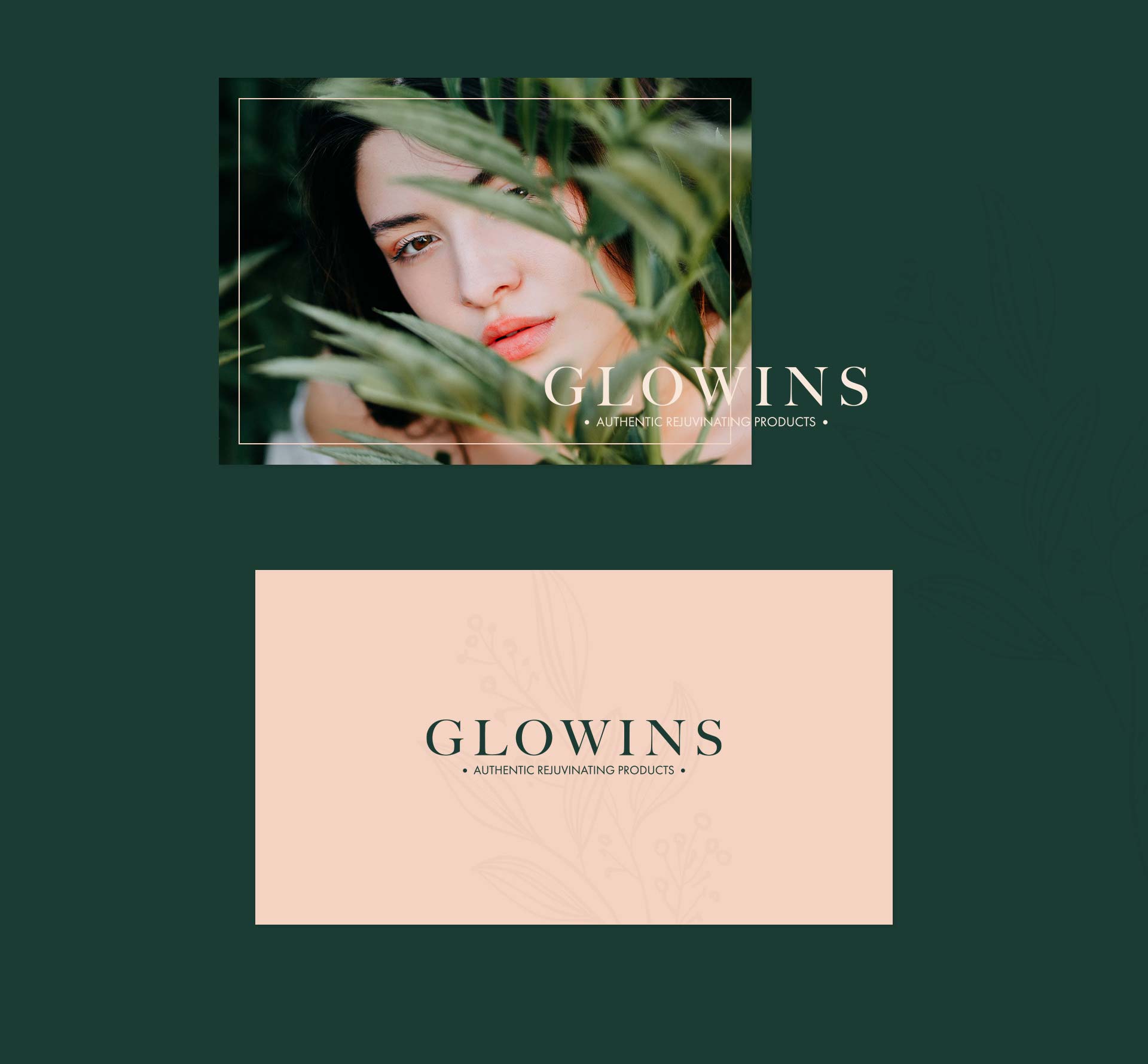
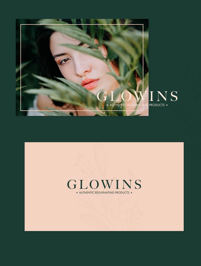
The unique Sherwood green and Moonlight grey color with an illustration of a natural leaf is used to reflect the natural, chemical free products.
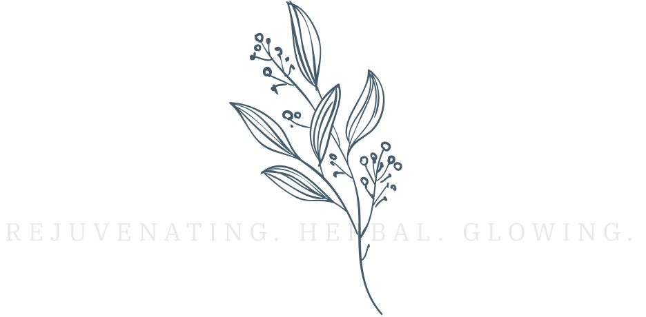
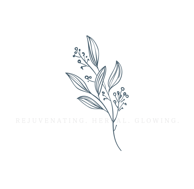
The design picks inspiration from the earthy natural elements and softness of the petals of nature and tries to convey a natural, smooth, perfect, Glow-in skin.
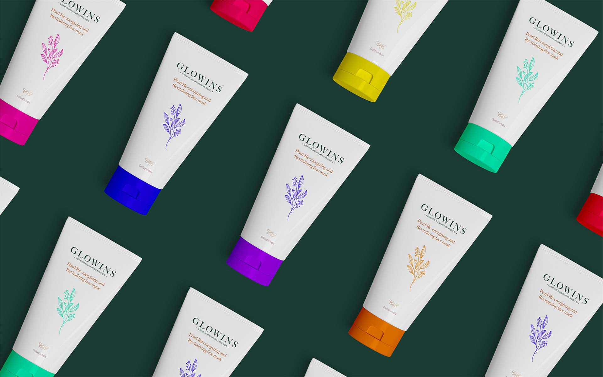
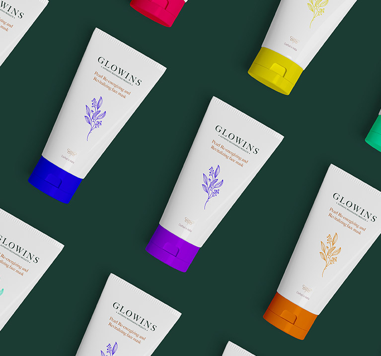
Bright, natural colors are used to differentiate the wide range of products.
Browse More Project